New to Version 1.8.8: Massive Icon Update

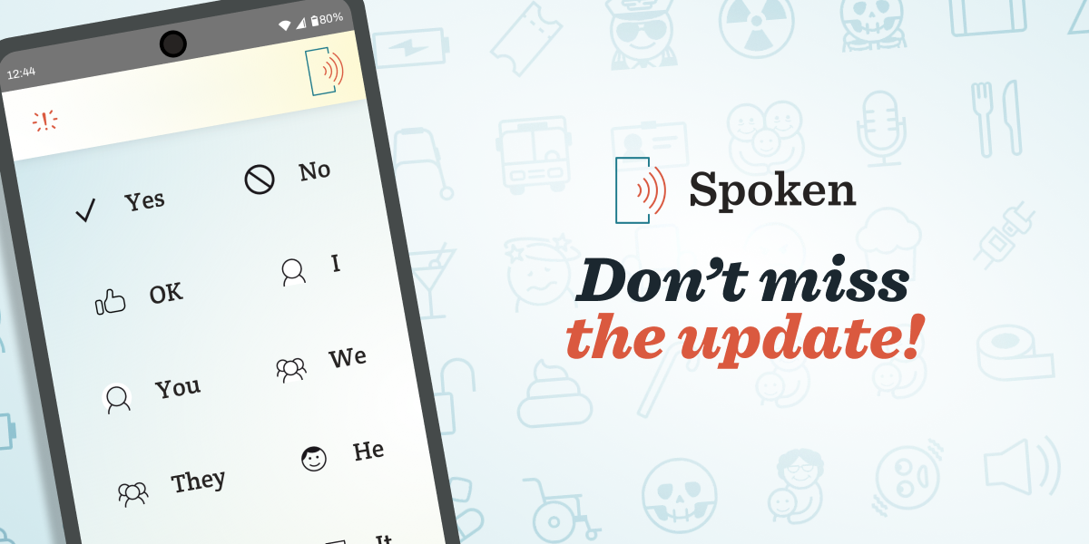
We are thrilled to announce that Spoken 1.8.8 is now available on both Google Play and the Apple App Store! If your device hasn’t automatically updated the app, we encourage you to initiate it manually to ensure you have access to the latest features and improvements.
While this update was initially intended as a quick bugfix, it ended up evolving into an opportunity to significantly expand our icon library. With over 600 words receiving new or updated icons, 1.8.8 has become another milestone in our ongoing effort to enhance user experience and functionality. Plus, we didn’t forget to squash those bugs!
How did the update evolve?
While adding new icons or symbols is always on the back of our minds at Spoken, it often takes a backseat to more pressing work. Fixing bugs, developing new features, and improving our system can take up a lot of time with a small team like ours—and that’s just the tip of the iceberg when it comes to all the things we have to do. That being the case, we rarely get to add icons in large batches.
Fortunately, a new project we’re working on necessitated the creation of several new icons for a mockup (if any especially astute readers spot a through line connecting some of the icons, no you didn’t!). After the mockup was complete, we decided to keep going, attempting to address as many noticeable gaps in our icon library as we could before 1.8.8 was ready to push out.
The Icon Design Process
Up to this point, we’ve shared the journey and accomplishments of Spoken’s latest update from a broader, company-wide lens. However, I’d like to take a moment to shift to my personal perspective as Spoken’s resident designer as I explain the process of creating the new icons.
The deep dive into expanding our visual language was a great exercise and I’m glad to have been a key part of it. Every icon we add helps enrich the app because it makes word recognition easier. While that’s just a quality of life improvement for some users, it’s pretty significant for those who struggle with word retrieval due to conditions like anomic aphasia. Still, visual aids also help users without these issues find words faster, which isn’t anything to sneeze at.
I would say the hallmark of our icons is their intuitive design. We strive for simplicity and clarity, allowing users to quickly recognize and understand each symbol without needing any additional context. They also need to be able to work at a small scale so we can fit as many as possible on a smartphone screen. All of these factors also combine to ensure that the icons don’t become a distraction instead of something genuinely helpful.

Each icon goes through an approval process so there are multiple eyes on them. This not only allows us to ensure style consistency, but also conceptual quality. We try to make sure each icon accurately and intuitively represents the words it is meant to be paired with. This is something that often requires multiple perspectives to get right. Ultimately, some icons needed to have their execution adjusted before they were approved and others were sent all the way back to the drawing board because they weren’t strong enough in concept.
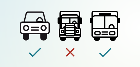
The approval process is also beneficial because it’s very easy to forget that words are homonyms. For instance, I was ready to add the new bus icon to the word “shuttle,” completely forgetting that the word has other uses that the bus icon would be inappropriate for. Because of our approval process, that mistake was fortunately avoided. Rest assured, you can still talk about space shuttles or badminton without any confusion.
How did we decide what to add?
My primary goal when creating new icons was to extend the app’s library to cover more of the vocabulary used in everyday situations and topics. Another priority was improving representation, particularly when it comes to disabilities. Of course, this was something that everyone at Spoken could get behind, but I also felt like it was my personal responsibility as the designer.
During this process, I took the daunting step of moving our list of needed icons from a spreadsheet to our project management software. Now, tickets are prioritized, which will hopefully allow us to add icons with greater frequency and also keep things more up-to-date.

How did we add icons to 600+ words in a minor update?
Adding icons to over 600 words was a more streamlined process than you might expect. Surprisingly, it only took the creation of fifty new icons. Many were used across several words—generally synonyms. We also found opportunities to assign older icons to more words. Hopefully this admission doesn’t make the endeavor sound unimpressive; I personally believe the broad applicability of Spoken’s icons highlights our commitment to smart design. If we think it’s appropriate, we intentionally create them to be versatile so we can find more uses for them later.

Final Thoughts
With the launch of update 1.8.8, we’re excited to offer our users a more enriched Spoken experience. Remember to update the app if you haven’t already, if for nothing more than to look for some of the new icons. Who knows, it could be fun!
What are your thoughts on this update? Your feedback is crucial to us as we continue to improve Spoken. Whether these updates have positively impacted your communication or if there are areas you think we could improve, we’re eager to hear from you.
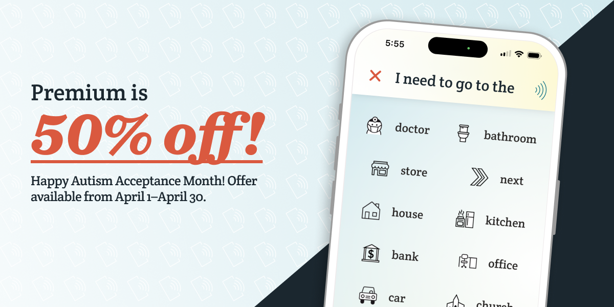
By the way, if you love Spoken, don’t miss our sale on Premium. For more details, see our other blog: Spoken Premium Is 50% Off for Autism Acceptance Month!
Thank you for your continued support and for being a part of Spoken’s journey!
About Spoken
Spoken is an app that helps people with aphasia, nonverbal autism, and other speech and language disorders.


