Careless and Confusing Icon Choices Are Bad for AAC Users
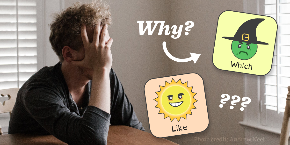
Whether we’re talking about dedicated devices, apps, or boards, icons are a crucial part of Augmentative and Alternative Communication (AAC) systems. They’re not just pictures; they’re the key to effective communication for many users. However, not all icons are created equally—a poorly designed icon can actually make communication more difficult for AAC users. Because of that, it’s frustrating when AAC apps use icons that just don’t make sense.
The Role of Icons in AAC
Before we dive into everything that can go wrong with AAC icons, it’s crucial to explain why it’s so important to get them right. There are two pretty distinct reasons to include icons alongside words: for recognition and for clarification.
Icons are used for recognition everywhere, not just in AAC systems. For instance, the word processor this article was typed in is full of them. Icons aren’t just a digital phenomenon, though; they’re used everywhere, like on traffic signs or wayfinding. This ubiquity stems from the fact that humans can usually identify an image faster than a word. In an AAC interface packed full of different terms, it can be hard to locate the one you need quickly; this process is much faster if the word is placed next to a highly legible icon that symbolizes it in some way. In that regard, a good AAC icon is one that the viewer should be able to quickly intuit the meaning of.
For users that have trouble reading or understanding written language, icons are also used for clarification. For instance, when a person with aphasia has trouble recognizing a word, an icon can help them figure out if it’s the correct one or not.
Unfortunately, many AAC systems fail to choose or design icons that fulfill these purposes. This oversight can significantly impair the usability of these systems, particularly for individuals who rely on them for everyday communication. When icons are not intuitively designed or do not clearly represent their associated terms, it leads to confusion, miscommunication, and a steep learning curve for users. This not only defeats the primary purpose of AAC systems, which is to facilitate communication, but also places unnecessary barriers in the path of users who already face significant challenges in expressing themselves.
The success of AAC systems hinges on their ability to provide clear, intuitive, and meaningful visual communication aids. By prioritizing the design and selection of effective icons, developers can greatly enhance the communicative efficacy of these systems, thereby empowering users with the means to express themselves more freely and accurately.
Beware of How Icons Are Interpreted
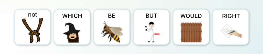
Something unfortunate we’ve seen is the use of homophones as visual representations of words. Using an icon of a witch for “which,” a wooden plank for “would,” or a bee for “be” might seem clever, but it’s not helpful for recognition and is unlikely to aid in clarification. In fact, using a homophone might do the opposite, turning the user away from a word because the icon doesn’t represent it accurately. Plus, soundalikes might not be as obvious for certain audiences like the deaf or people with different linguistic backgrounds.
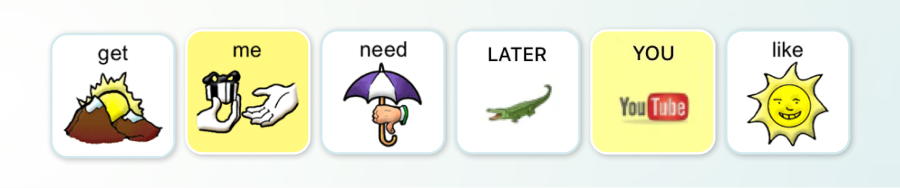
Similarly, the use of idioms or cultural references, like an alligator for “later” (playing on the phrase “see you later, alligator”) or the YouTube logo for “you,” are almost certainly going to be taken literally rather than aiding in locating or understanding the words they’re paired with. Besides, these choices assume a level of cultural and linguistic knowledge that not all users possess.
Even worse are icons that have no apparent connection to the words they represent, like a mountain range for “get” or an umbrella for “need.” These choices are not just unhelpful; they can actively hinder the usability of AAC by obscuring the intended message. Random icons shouldn’t be placed next to words just for the sake of filling space. If anything, a universal placeholder icon—which is clearly distinct from a word icon—should be used instead.
Let’s be real, any icon depicting something straightforward and familiar is likely to be taken at face value. Going back to one of the previous examples, expecting an icon of an alligator to be interpreted as anything other than “alligator” is highly unrealistic. Without the context of the full phrase “see you later, alligator,” the leap from the image of an alligator to the concept it’s supposed to represent is far too great for anyone to make intuitively. If you need to represent the word “later,” try exploring ways to convey temporality and sequence instead. Even if the final product isn’t universally understood, at least it’s unlikely to be confused with something completely unrelated.
Conversely, some icons suffer from being too complex. This applies to both the visual presentation or the conceptual foundation. Icons are meant to make understanding an almost seamless process, but that requires them to be clear and easy to follow. They shouldn’t take time to study or think about before they click. If they do, they’re not doing their job.
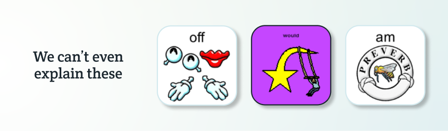
Unfortunately, none of the examples mentioned or shown above are hypothetical. Rather, they’re genuine icon choices found on default AAC boards. When so many icons fail at what they’re there for in the first place, it’s a clear sign that many AAC developers have yet to see the importance of smart design. It’s a critical part of making AAC tools successful utilities.
The Limitations of Icons and Our Design Philosophy
We get it, some things are inherently challenging to symbolize through an icon, if not impossible. This especially applies to abstract concepts or any other words that don’t correspond to tangible objects. However, this difficulty is not an excuse to knowingly add icons to AAC that are likely to cause confusion or be interpreted incorrectly.
At Spoken, we put a great deal of time and consideration into each icon to ensure that they will actually be helpful. If something isn’t working, we would rather leave it out until a more effective solution is found. This careful consideration ensures that our AAC tool remains friendly to those who require icons to locate and understand words. However, this doesn’t mean we shy away from trying to represent more abstract things like parts of speech (e.g. conjugations, pronouns, or articles). Through the careful use of design elements like value, shape, and placement, we’ve found success at representing these.
Something important when it comes to these icons is that they’re designed in such a way that they’re unlikely to be interpreted literally. It may take some time for the user to ascertain its meaning and begin associating it with a particular word, but at least they won’t automatically confuse it with something completely unrelated. You know, like a large, semi-aquatic reptile.
Our goal at Spoken is to strike a balance between visual simplicity and the richness of language. We aim to provide a tool that not only facilitates communication but also supports quick recognition and understanding. By carefully considering which words and concepts are represented with icons and employing a strategic design system for the rest, we’ve created an AAC environment that is both powerful and intuitive.

About Spoken
Spoken is an app that helps people with aphasia, nonverbal autism, and other speech and language disorders.