Spoken Now Has 1,000+ Icons, but We’re Still Choosing Carefully
Spoken 1.9.2 is here, and with it comes another big batch of new icons! We’ve officially surpassed the 1,000-icon milestone, and we’re already nearing 1,500. But even with all that momentum, we still ask the same question for every single addition: “Is this actually helpful to the user?” Let’s be clear: although it’s exciting, this update was never about hitting numbers. We’re only where we are because of a focused effort to fill key gaps in Spoken’s icon library. Each icon in this update went through the same process we’ve always used, with our usual attention to clarity, consistency, and usefulness.
I’m Spoken’s resident designer, and in this post I’ll walk through some of the areas we focused on in this update and why. I’ll also be sharing a few of the icons that didn’t make it, because I think that’s just as important to highlight so you can get a better idea of our process.
The World Was Missing, So We Added It
Something we wanted to focus on with our additions this update cycle was making it easier to talk about current events. A lot has been happening in the world, so we thought it was more important than ever to make this a priority. But first, we needed to start with the world itself. That’s how we ended up with almost 60 icons representing different nations. Prior to the new update, countries were largely absent from the icon library outside of a sparse few third-party icons. The new icons are a set of clean, and visually consistent flags.
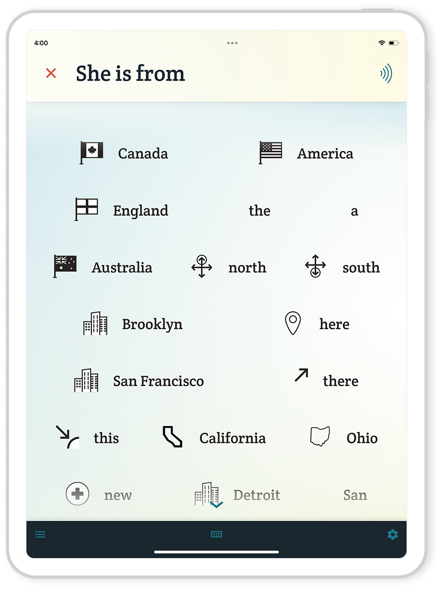
Now, I’ll be honest: flags aren’t perfect identifiers. Unless you moonlight as a vexillologist, you’re probably not instantly recognizing every national flag at a glance. Still, they’re the best shorthand we’ve got for most countries. Borders were our second option, but those are even harder to recognize (since not every country can be Italy). The only other thing we can really do is symbolize countries through recognizable landmarks or architecture. This can be a little confusing since it’s not a literal representation, but we’ll be doing it in cases where flags are indistinct. For instance, Egypt received an icon representing the pyramids of Giza.
With the flags, our hope is that you’ll start to recognize them the more you use the app. And even if you don’t, you’ll at least know that the word you’re looking at is a country. In a lot of cases, this will be enough information to tell you it’s not the word you’re looking for.
Talking About the News Just Got Easier
Of course, we didn’t stop at nations. We also added icons to words like government, law, taxes, stocks, recession, president, and even pope, among many others. So, overall, it’s a lot easier to discuss the things making the headlines than ever before. Of course, there’s plenty more to cover here, so we’ll continue to expand on these sorts of topics moving forward.
Sports, Style, and Everyday Stuff
Another big area of focus this time around was sports. I think these pair excellently with the country icons, because it enables talking about international events like the World Cup. But even on a smaller scale, sports are an important topic for a lot of people. You might be an athlete yourself, or an avid fan. So in this update, we’ve not only expanded the number of sports represented by icons, but also added icons to more conceptual terms like opponents and competition.
We also expanded a number of categories that show up in everyday conversations. Things like clothing, body parts, and your environment. A lot of these were foundational additions, meant to cover common words that people use to describe themselves and others, as well as their surroundings. These kinds of icons don’t always feel flashy, but they go a long way toward making Spoken feel more complete and useful in daily life.
Foods got a boost too. We always try to grow this category because we know how useful it can be to name specific foods. Whether you’re ordering a meal, sharing a preference, talking about dietary restrictions, or just trying to explain what’s in front of you, these words are handy. This round saw a particularly big uptick in fruit icons; watermelon, peach, and pineapple are just a few of the words you can look forward to having new ones.
Some Fun Ones
Not everything needs to be serious. That goes for both what you talk about and what I design. While we do have a priority system when it comes to designing icons, sometimes it’s good to step away from the high-stakes concepts and just make room for things that are fun, weird, or oddly specific. It helps you talk about a greater variety of things while giving me a much-needed break from figuring out how to symbolize words like quantity.
One of the more fun topics I’ve slowly been expanding on during my time making icons is Halloween. These words aren’t what you’d call “core vocabulary,” but I think it’s alright for AAC to make a little room for personality and playfulness. So if you ever wanted a werewolf icon, it’s in this update.
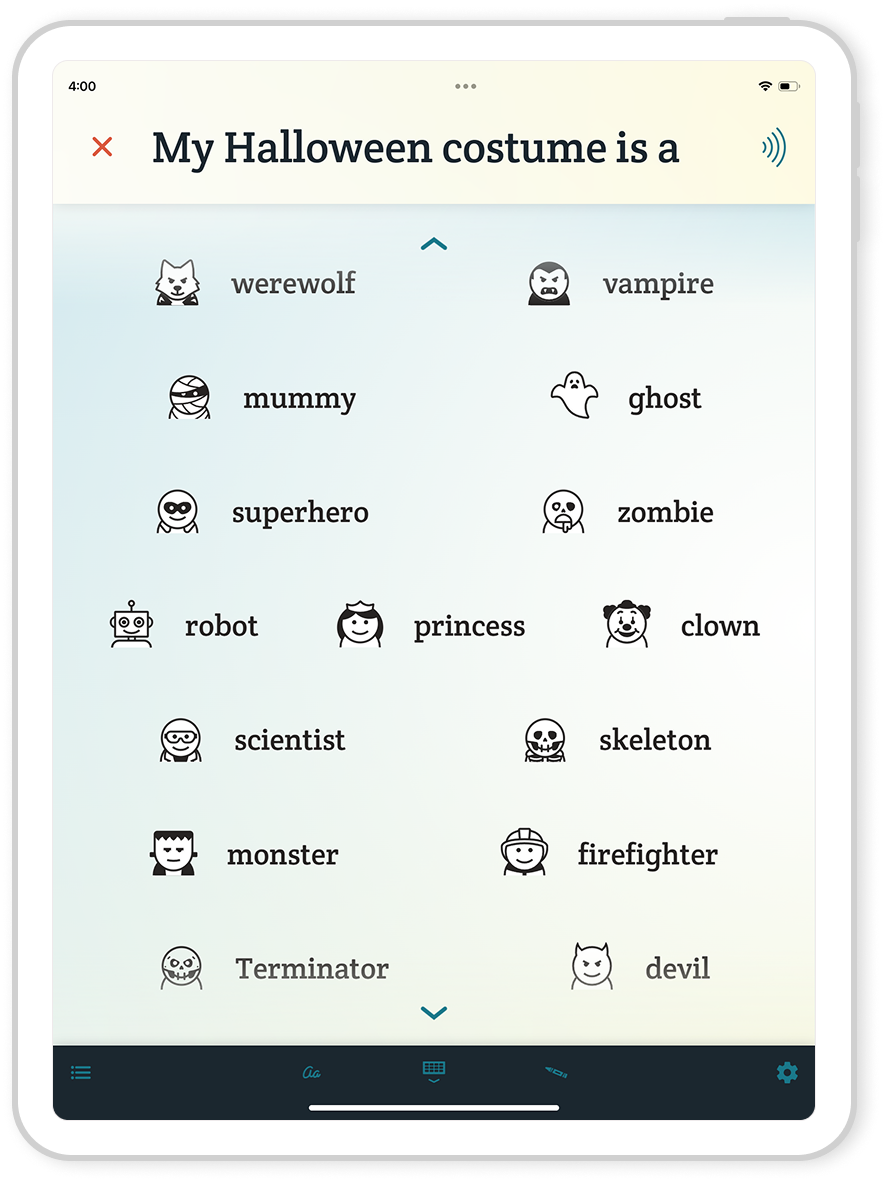
And yes, there’s even an icon for Halloween itself:
The Behind-the-Scenes Upgrade That Made Icons Better Across the Board
Behind the scenes, this update also includes a major upgrade — all icons have been converted to SVG file format. That’s undoubtedly meaningless to most non-designers, but the gist is that they don’t use pixels and can be made any size without losing quality. This makes it a lot easier to show close-up examples like the Halloween icon above. There are also a few applications for SVGs that we want to explore as possible features in the app. All this, and the file size is actually smaller than before, so the icons may even load faster.
Converting all the icons was no small task. We had to hunt down the original working files for over a thousand icons and then export them one-by-one. But the payoff is big. Now we’ve got cleaner visuals, better performance, and room to explore new ideas. Plus, this has energized us to phase out the last of our third-party PNGs in favor of a consistent visual style across the app.
The Icons That Didn’t Make the Cut
Of course, not every icon I worked on made it into 1.9.2. We’re picky about what we add to the app, because we want our icons to be helpful, not distractions.
Some abstract concepts just don’t translate well into visuals. I had a few failed attempts at designing icons for words like:
- Tall
- Short
- Likely
- Unlikely
- Fake
- Memories
- Worthless
Nothing I tried for these felt quite right. Or worse, some of them risked being misleading. Take tall for example. Sure, I could draw a tall person, but tall can refer to more than just people. You could use it to describe trees, buildings, or even a glass of water. It would be confusing if we narrowly focused on the height of a person when users might be seeing that icon in contexts where they’re not talking about a person at all. That’s why we tried more abstract versions, but they weren’t working well either. And when we can’t get an icon right, we’d rather leave it out than risk misleading anyone or turning it into a distraction.
We also had a few literal icons that just didn’t pass our clarity test. My attempts at jungle didn’t read well enough, for example. And the attempt at teeth I submitted was not only too busy, but also creepy! It wasn’t something we wanted popping up mid-conversation.
Why We Don’t Add an Icon for Everything
We only add icons to Spoken that will help you recognize and find words faster. If an icon is confusing or unclear, it’s not doing its job and could actually slow you down. We’ve seen what happens when AAC systems use icons based on puns, idioms, or obscure visual metaphors (documented in our blog, Careless and Confusing Icons). They might seem clever, but they don’t work. That’s why we don’t force an icon for every word. In some cases, no icon is better than a bad one.
What’s Next?
We’re proud of everything 1.9.2 brings to the table, and we’re excited to keep building from here. You’ll keep seeing new icons in future updates, but only the ones that meet our standards for clarity, simplicity, and usefulness.
P.S. If you haven’t updated the app yet, go do that! The new icons, and better-looking old ones, are waiting for you.

About Spoken
Spoken is an app that helps people with aphasia, nonverbal autism, and other speech and language disorders.